
Understanding the Unique Characteristics of Walnut Finish
Walnut finish stands out as one of the most sought-after options in home furnishings, prized for its rich, chocolate-brown color palette that ranges from warm medium tones to deep, luxurious dark hues. This versatile wood carries distinctive warm undertones that lean slightly toward the red-purple spectrum, creating a sense of depth and character that few other woods can match.
The grain pattern of walnut is another defining characteristic that sets it apart. Unlike the more uniform appearance of some woods, walnut showcases a straight to wavy grain with occasional curls and burls that create natural visual interest. These patterns tell a story within each piece, making walnut furniture feel more organic and artisanal.
It’s worth noting the difference between solid walnut and walnut veneer or finish. Solid walnut is made entirely from the walnut tree, while walnut veneer consists of a thin layer of actual walnut applied over a different wood base. A walnut finish, meanwhile, might be a stain or treatment applied to another wood type to mimic walnut’s appearance. Each has its place, though solid walnut typically offers the most authentic aging characteristics.
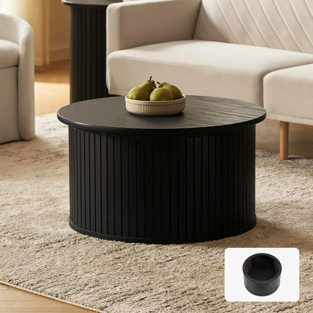
Speaking of aging, walnut has a fascinating relationship with time. Unlike many woods that darken with age, walnut actually tends to lighten slightly over the years, developing a honey-like patina that many designers and collectors find even more appealing than its initial appearance. This quality makes walnut pieces like intelligent black mid-century coffee tables excellent investments that evolve beautifully in your space.
Walnut’s versatility cannot be overstated. It became an icon of mid-century modern design for good reason – its warm, natural elegance complements both vintage and contemporary aesthetics. Whether in a minimalist apartment or a traditional home, mid-century modern walnut coffee tables serve as sophisticated anchors that bridge different design elements.
The Science of Wood Tone Compatibility: Core Principles
Successfully mixing walnut with other wood tones isn’t merely a matter of personal preference—there’s actual science behind what makes certain combinations work. Understanding these fundamental principles will help you create spaces that feel intentionally designed rather than randomly assembled.
Color theory provides our starting point for wood tone compatibility. Just as you would approach mixing colors in art or fashion, woods have undertones that either harmonize or clash. Walnut typically carries warm undertones with hints of red and purple, which influences which woods will naturally complement it.
Here are the core principles that guide successful wood mixing:
Undertone Alignment: Identify whether woods have warm undertones (yellow, orange, red) or cool undertones (gray, blue). Walnut has warm undertones, so it often pairs naturally with other warm-toned woods. Mixing warm and cool undertones requires more care and intention.
Contrast Creation: Deliberate contrast between light and dark woods creates visual interest and prevents the “almost matching but not quite” problem. Light maple or ash can beautifully offset walnut’s deeper tones.
Balance and Proportion: Follow the 80/20 rule—let one wood tone dominate (about 80%) while accent woods make up the remaining 20%. This prevents visual chaos in a space.
Repetition Strategy: Repeat each wood tone at least once in a room to create a sense of intentional design. A single piece in a different wood can look like a mistake; multiple pieces create a pattern.
Grain Consideration: Beyond color, the grain pattern matters. Walnut’s often straight to wavy grain can be complemented by woods with different grain characteristics to add textural interest.
The “rule of three” often applies successfully to mixing woods—limiting your space to three different wood tones helps maintain cohesion while still allowing for interest. For example, a walnut coffee table might be paired with light oak flooring and medium-toned cherry accessories.
Understanding these principles provides the foundation for making informed choices when styling interiors with walnut furniture. Rather than following rigid rules, these guidelines help you make intentional decisions that result in harmonious spaces.
Perfect Pairings: Woods That Complement Walnut Finish Tables
Light Woods for Striking Contrast
Light-colored woods create dramatic yet pleasing contrast when paired with walnut’s rich tones, resulting in spaces that feel balanced and dynamic.
Oak (particularly white or light oak) works wonderfully with walnut because its prominent grain provides textural interest while its lighter color creates visual separation. The warmth in both woods creates a bridge of compatibility despite their color difference. Consider a walnut coffee table atop a light oak floor, or light oak shelving above a walnut console.
Maple offers a clean, contemporary feel when paired with walnut. Its subtle grain and creamy color create a striking lightness that allows walnut pieces to stand out as focal points. The combination feels fresh and modern, perfect for spaces where you want a bit of brightness without sacrificing sophistication.
Ash features a similar grain pattern to oak but with a slightly cooler undertone, making it an excellent complement to walnut when you want to add subtle contrast. Its straight grain creates an interesting counterpoint to walnut’s often more varied pattern.
Medium-Toned Woods for Harmonious Blending
Medium woods require careful consideration but can create rich, layered environments when properly paired with walnut.
Cherry presents an interesting pairing opportunity. Initially, cherry has a lighter reddish tone, but it darkens significantly over time, developing a rich patina. When combined with walnut, consider the aging trajectory of both woods—they’ll evolve differently. Their shared warm undertones create natural harmony, though you’ll want to ensure enough contrast remains between them.
Mahogany with its reddish-brown tones can work beautifully with walnut when you’re aiming for a rich, traditional look. The key is maintaining enough distinction between the two so they don’t appear to be “almost matching.” Using them in different applications—perhaps walnut for tables and mahogany for larger case pieces—can help establish clear differentiation.
Similar walnut tones from different walnut species or finishes can create subtle depth. Even within the walnut family, variations in color and grain allow for interesting combinations. Mixing black walnut with English walnut, for instance, provides subtle variation while maintaining cohesion.
Dark Woods for Sophisticated Statements
Dark wood pairings create dramatic, sophisticated environments when balanced properly.
Ebony and ebonized woods offer maximum contrast with their near-black appearance. When used sparingly with walnut, they create striking design moments. Consider ebonized accents or small furniture pieces to punctuate a space featuring a walnut table.
Very dark stained woods like dark oak or maple can complement walnut while creating a moody, elegant atmosphere. The key is ensuring the room has enough light elements (through walls, textiles, or lighting) to prevent the space from feeling too heavy.
Non-Traditional Options
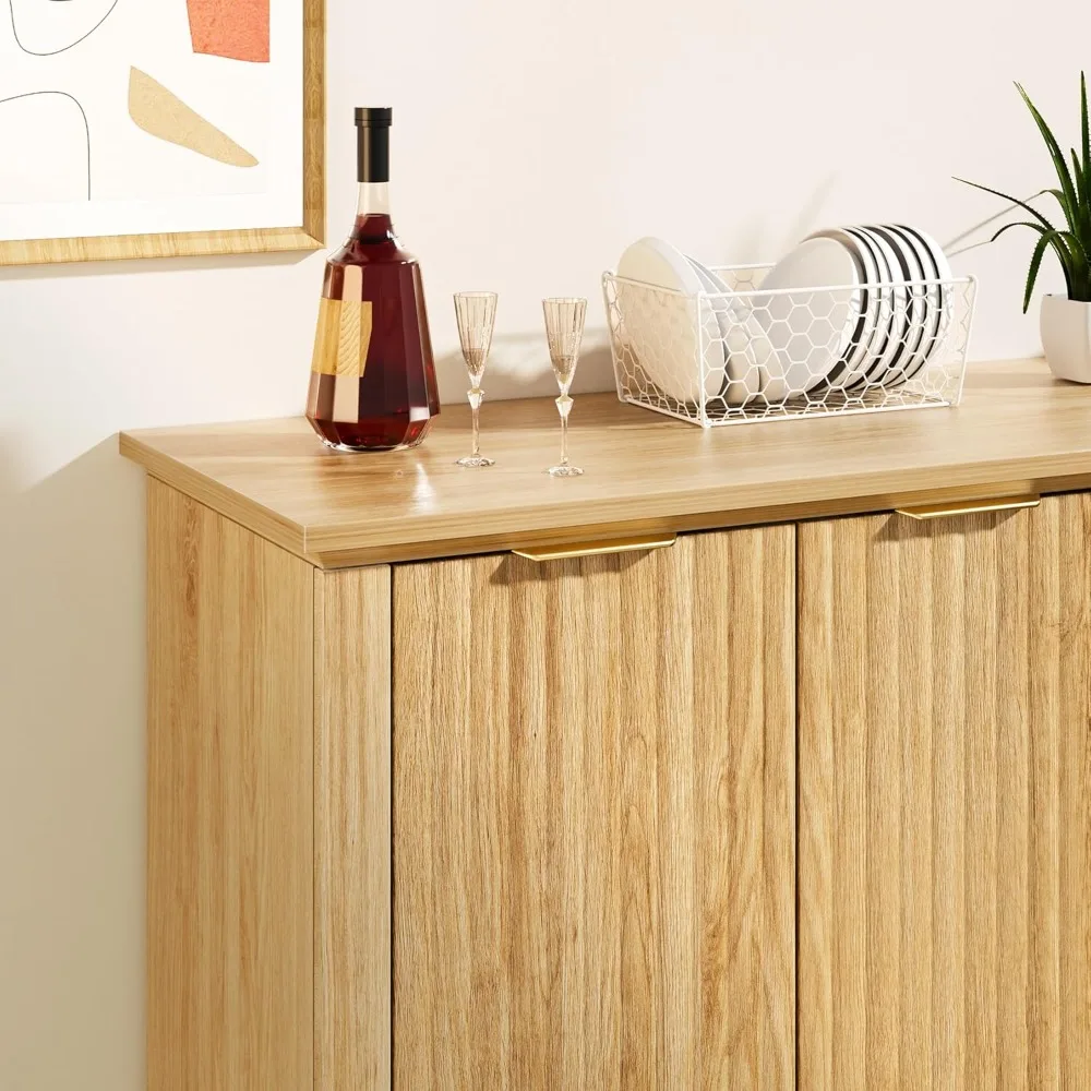
Painted wood pieces offer tremendous flexibility when working with walnut. White or cream-painted wood creates clean contrast while maintaining a warm environment. Soft grays complement walnut’s richness while adding a contemporary touch. Bold colors can make walnut pieces pop as feature elements in a space.
Distressed and weathered finishes bring textural interest when paired with walnut’s typically smooth, refined surface. The juxtaposition of rustic and refined creates dynamic spaces with visual depth. Solid wood coffee tables in various finishes demonstrate how these combinations can work harmoniously together.
Bridging Elements: Unifying Different Wood Tones
Even the most thoughtfully selected wood combinations benefit from elements that help unite them visually. These bridging elements create cohesion and prevent the disjointed feeling that can occur when mixing different wood tones.
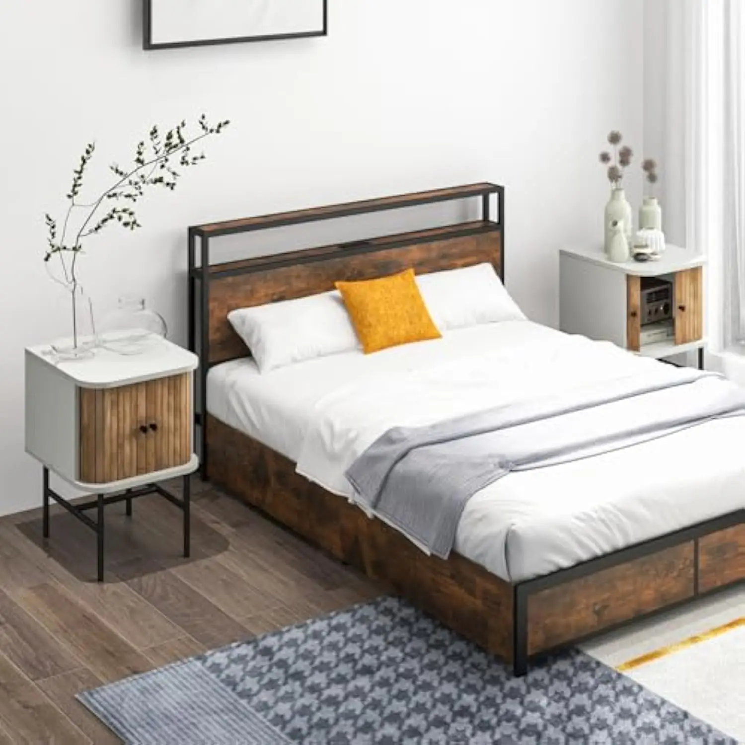
Textiles serve as powerful connectors between different woods. Area rugs that incorporate colors found in both your walnut table and other wood tones can visually tie them together. Look for patterns or colors that reference the various wood undertones in your space. Similarly, upholstery fabrics can echo wood tones—a sofa in a warm taupe might reference the lighter aspects of walnut grain while complementing lighter wood elements elsewhere in the room.
Metal accents create natural transitions between different woods. Brass and gold tones particularly complement walnut’s warmth while also working well with both lighter and darker woods. Consider hardware, lamp bases, or decorative objects in consistent metal finishes to create a unified thread throughout your space. A coffee table with brass details can connect visually to a lighter wood bookcase with similar metal elements.
Thoughtful color schemes support mixed wood environments by providing a cohesive backdrop. Wall colors that complement all the woods in your space help create harmony. Soft neutrals with warm undertones often work well with walnut while still supporting lighter woods. The right paint color can make different wood tones feel intentionally collected rather than randomly assembled.
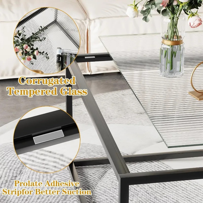
Glass and other transparent materials create visual breaks between wood elements, preventing wood overload. Glass top coffee tables with walnut frames can reduce the visual weight of wooden pieces while still showcasing the beauty of the wood. Glass elements allow each wood tone to stand on its own without directly competing with others.
Strategic lighting enhances wood tone relationships by highlighting complementary aspects of different woods. Warm-temperature bulbs typically flatter all wood tones, bringing out the richness in walnut while softening potential clashes with other woods. Consider adjustable lighting that can be modified to best showcase your wood combinations.
Room-by-Room Guide: Incorporating Walnut Tables Throughout Your Home
Living Room Strategies
The living room often presents the greatest challenge—and opportunity—for mixing wood tones effectively, as it typically contains multiple furniture pieces.
A walnut coffee table can serve as an anchor in your living space, with thoughtfully selected companion pieces creating a cohesive environment. Consider these approaches:
Pair a substantial walnut coffee table with lighter wood side tables for pleasing contrast, or select coffee and end table sets designed to work in harmony with additional wood elements.
When incorporating entertainment centers and shelving, maintain balance by keeping larger wood surfaces in complementary tones. A walnut coffee table paired with a very similar entertainment center might feel heavy; instead, consider lighter wood tones or painted finishes for larger pieces.
Upholstered furniture creates breathing space between wood elements. Choose fabrics that reference the undertones in your walnut and other wood pieces—warm neutrals often work beautifully.
Dining Room Harmony
The dining room presents unique challenges as the table typically serves as the focal point.
A walnut dining table creates an elegant foundation for various chair options. Consider:
Contrast chairs in lighter woods like ash or oak for a dynamic mix that feels intentionally designed.
Upholstered chairs eliminate potential wood conflicts while adding comfort and texture.
Match chair legs to your table for subtle cohesion while varying seat materials.
Sideboards and china cabinets don’t need to match your table exactly—in fact, slight variation often creates more interesting spaces. A walnut table paired with a lighter buffet can create pleasing visual weight distribution.
Creating unity between floor and ceiling elements helps pull everything together. Area rugs that incorporate colors from your various wood tones can unify the space, while lighting fixtures with wood or complementary metal elements can draw the eye upward and complete the design story.
Home Office Integration
The home office benefits from thoughtful wood mixing that promotes both productivity and aesthetic pleasure.
A walnut desk paired with complementary shelving creates a sophisticated work environment. Consider:
Bookcases in lighter woods to prevent the space from feeling too heavy or closed-in.
Office chairs with wood elements that either match or intentionally contrast with your desk.
Accessories like desk organizers or picture frames that reference other wood tones in the space, creating visual connections.
The key to successful home office design is balancing function with beauty. Walnut’s natural elegance adds sophistication while creating a grounding effect that supports focus and productivity.
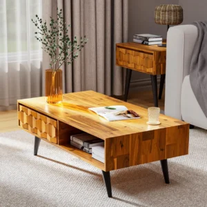

Mid-Century Modern Solid Wood Coffee Tables, Mid-Century Modern Teak Coffee Tables
$879.95 Select options This product has multiple variants. The options may be chosen on the product page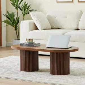
Mid-Century Modern Danish Coffee Tables, Mid-Century Modern Oval Coffee Tables, Mid-Century Modern Solid Wood Coffee Tables
$390.05 Select options This product has multiple variants. The options may be chosen on the product page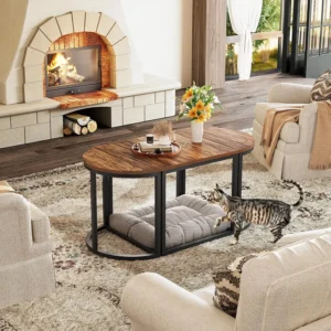
Mid-Century Modern Coffee & End Table Sets, Mid-Century Modern Coffee Table Sets, Mid-Century Modern Oval Coffee Tables
Price range: $257.48 through $331.04 Select options This product has multiple variants. The options may be chosen on the product page
Mid-Century Modern Glass Top Coffee Tables, Mid-Century Modern Glass Top Side & End Tables
$460.58 Select options This product has multiple variants. The options may be chosen on the product page
Mid-Century Modern Glass Top Coffee Tables, Mid-Century Modern Vintage Coffee Tables, Mid-Century Modern Vintage Side & End Tables
$725.36 Select options This product has multiple variants. The options may be chosen on the product page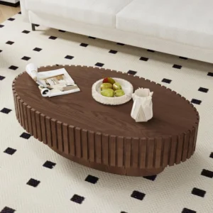
Mid-Century Modern Oval Coffee Tables, Mid-Century Modern Solid Wood Coffee Tables
$679.56 Select options This product has multiple variants. The options may be chosen on the product page
Practical Application: Step-by-Step Mixing Process
Creating a cohesive space with mixed wood tones becomes straightforward with a methodical approach. Follow these steps to confidently combine your walnut table with other wood elements:
Assess existing wood tones and fixed elements in your space. Make note of flooring, trim, cabinetry, and any furniture pieces you plan to keep. These establish your baseline and can’t be easily changed.
Identify the undertones in your walnut piece and other woods. Is your walnut table warm with red undertones? Are your floors cool-toned or yellow-toned? Place a white piece of paper next to each wood to make undertones more visible—they’ll appear as subtle color casts.
Decide on your approach: contrast or harmony. Do you want your walnut table to stand out dramatically against lighter woods, or blend more subtly with woods of similar tone? This fundamental decision guides your subsequent choices.
Select complementary woods based on the principles outlined earlier. If choosing contrast, consider maple or ash; if seeking harmony, perhaps cherry or similar walnut variations with slight differences.
Introduce unifying elements like metals, textiles, or glass pieces that bridge your wood tones. These create visual connections between different woods, helping them feel like part of a cohesive plan.
Evaluate the balance of your space, making adjustments as needed. Step back and assess whether any wood tone feels too dominant or if the mix feels random rather than intentional.
When evaluating potential combinations, gather samples or create a mood board before making major purchases. The relationships between black mid-century coffee table design elements and walnut finishes, for instance, can be better assessed when seen together rather than imagined separately.
Remember that natural light affects how wood tones appear—check your combinations in the actual lighting conditions of your space throughout the day before finalizing decisions.
Common Mistakes to Avoid When Mixing Wood Tones
Even with the best intentions, certain pitfalls can undermine your wood-mixing efforts. Awareness of these common mistakes will help you navigate your design choices more successfully.
The “too similar but different” problem occurs when woods are close in color but not quite matching. This creates the impression of a mistake rather than an intentional design choice. For example, placing a medium-brown oak side table next to a medium-brown walnut coffee table might look like a failed attempt at matching. Solution: Either match exactly or create clear, intentional contrast.
Overdoing the variety by incorporating too many different wood species can make a space feel chaotic and unplanned. When working with walnut, limit additional wood tones to two or three at most. Solution: Establish a primary wood (walnut), a contrasting wood, and possibly one accent wood, but resist adding more.
Neglecting undertones leads to combinations that subtly clash. A walnut table with warm red undertones might feel discordant beside oak with strong yellow undertones, even if their depth of color is complementary. Solution: Always identify and consider undertones when selecting wood combinations.
Failing to create either intentional contrast or cohesion results in spaces that feel accidentally assembled. Without clear design intent, mixed woods can appear random. Solution: Decide whether you’re pursuing contrast or harmony, then make choices that clearly support that direction.
Forgetting to balance wood tones throughout the space creates visual weight problems. Too much dark wood on one side of a room and light wood on the other can make the space feel lopsided. Solution: Distribute wood tones somewhat evenly throughout the space for visual balance.
Understanding how various styles go well with mid-century modern aesthetics can help you avoid these mistakes while creating cohesive, sophisticated spaces that showcase your walnut pieces effectively.
Supplemental Content: Adapting to Different Design Styles
Walnut tables show remarkable versatility across various design styles, each highlighting different aspects of this exceptional wood.
Mid-century modern represents walnut’s natural habitat. The movement embraced walnut for its warm character and elegant grain patterns, featuring clean lines and organic curves that showcase the wood’s natural beauty. Walnut tables in this style typically feature tapered legs, subtle curves, and minimal ornamentation. When mixing woods in mid-century spaces, maintain the era’s appreciation for natural materials while honoring its preference for simplicity.
Contemporary minimalist approaches leverage walnut’s rich tone as a counterpoint to otherwise simple spaces. In minimalist settings, a walnut table can serve as the “warm moment” that prevents the space from feeling cold or sterile. Pair with very light woods like bleached maple or white oak for maximum contrast, keeping the overall palette limited.
Traditional and transitional styles benefit from walnut’s timeless quality. In these settings, walnut mixes beautifully with classic woods like cherry and mahogany. The key is maintaining traditional proportions while perhaps updating the combinations slightly—mixing walnut with painted pieces creates a transitional look that respects tradition while feeling current.
Industrial and rustic integrations create interesting tension between walnut’s refinement and more rugged elements. Walnut tables pair surprisingly well with reclaimed woods, particularly when metal elements bridge the two. The combination of smooth, refined walnut with weathered wood textures creates rich visual interest.
Proper walnut finish durability and care ensures your tables will continue to enhance your chosen design style for years to come, adapting gracefully as your taste evolves.
FAQ: Solving Specific Wood Mixing Challenges
Q: Can I mix walnut with my existing oak floors?
A: Absolutely! Walnut and oak create a classic pairing, particularly if your oak has warm undertones. The contrast between oak’s typically lighter color and walnut’s richer tone creates natural visual interest. Use textiles and metal accents in consistent finishes to further unite these woods.
Q: How many different wood tones are too many?
A: While there’s no absolute rule, most designers recommend limiting a space to three distinct wood tones. Beyond this, rooms tend to feel busy or disjointed. With a walnut table as your focal point, consider one lighter wood and perhaps one darker wood as your complete palette.
Q: Should my walnut table match my kitchen cabinets?
A: Not necessarily. If your dining area is open to the kitchen, coordinating (not matching) is ideal. Ensure the undertones are compatible—warm walnut works with warm-toned cabinets. If your cabinets are painted, select a color that complements walnut’s richness.
Q: How do I work with very dark walnut finishes?
A: Very dark walnut benefits from contrast to prevent spaces from feeling heavy. Incorporate lighter woods, painted pieces, or glass elements. Ensure adequate lighting, and consider lighter walls and textiles to balance the visual weight of dark walnut.
Q: Is it necessary for all my wood furniture to match?
A: Definitely not! In fact, perfectly matched wood sets often create less interesting spaces than thoughtfully mixed wood tones. The key is mixing with intention rather than by accident, following the principles of coordinating undertones and creating either purposeful contrast or harmony.
Final Thoughts: Embracing Confidence in Your Design Choices
As you navigate the art of pairing your walnut table with other wood tones, remember that the principles outlined here serve as guidelines rather than rigid rules. The most inviting spaces often reflect personal expression within these guidelines.
Trust your instincts about what feels harmonious to you. If a combination brings you joy when you enter the room, that response is valuable feedback about its success. The technical aspects of undertones and contrast matter, but so does your emotional response to your space.
Walnut’s remarkable versatility makes it an ideal foundation for mixed-wood environments. Its rich character complements so many other materials that it naturally facilitates successful combinations. Whether paired with lighter woods for contrast or similar tones for sophistication, walnut tables from Hearth Forms create a timeless anchor for your design vision.
Remember that the most beautiful interiors tell a personal story through thoughtfully chosen elements. Let your walnut table be a chapter in that story—one that speaks to quality, timelessness, and intentional design. With the knowledge you’ve gained, you can mix woods with confidence, creating spaces that feel both cohesive and uniquely yours.