
The Essence of Scandinavian Color Philosophy
Scandinavian design is built upon three fundamental principles: simplicity, functionality, and a deep connection to nature. These principles aren’t just about aesthetics—they’re rooted in the Nordic way of life and directly inform the color palettes that have made this design style so enduring and beloved.
The harsh Nordic climate, with its long, dark winters and limited daylight, played a crucial role in shaping the characteristic Scandinavian color palette. When natural light is scarce for much of the year, interiors must maximize what little light is available. This geographical reality pushed designers toward lighter colors that reflect and amplify available sunlight.
Two cultural concepts further influenced these color choices:
* Hygge (pronounced “hoo-ga”): The Danish notion of coziness and contentment
* Lagom: The Swedish philosophy of balanced living—not too much, not too little
Understanding color is not merely decorative when it comes to intelligent black mid-century coffee tables and other Scandinavian furniture pieces; it’s the foundation upon which the entire design ethos rests. The colors chosen reflect both practical needs (light reflection) and philosophical values (harmony with nature).
The evolution of Scandinavian design has been shaped by these principles, creating a distinct approach to color that sets it apart from other design movements. While Scandinavian vs midcentury modern design share some similarities, their approaches to color reveal fundamental differences in philosophy and application.
The Foundation: Neutral Colors in Scandinavian Furniture
Neutrals form the cornerstone of Scandinavian color schemes, creating the bright, airy atmosphere for which this design style is renowned. White, in all its variations, dominates as the primary canvas. Pure white brings crisp clarity, while off-white offers subtle warmth, and warm white introduces a gentle coziness without compromising light reflection.
Grays serve as sophisticated companions to these whites, adding depth and dimension to Scandinavian interiors. Light grays maintain the airy feel while providing subtle contrast; medium grays add substance and visual weight; charcoal grays introduce dramatic punctuation when used sparingly on smaller pieces or details.
Beiges and earthy creams act as warming agents within this neutral foundation. These colors soften the potential starkness of whites and grays, adding a natural quality that makes spaces feel lived-in and welcoming rather than clinical or austere.
What makes these neutrals distinctly Scandinavian is how they interact with natural light. The colors are chosen specifically to capture, reflect, and amplify whatever sunlight enters the space. This light interaction creates a dynamic quality where the same mid-century modern white coffee tables might appear differently throughout the day as light conditions change.
These neutrals don’t just exist in isolation—they create the perfect backdrop for the other elements of Scandinavian color schemes. They allow natural wood tones to stand out and provide a calm canvas against which accent colors can make selective statements without overwhelming the space.
Natural Wood: The Living Color of Scandinavian Design
In authentic Scandinavian design, wood isn’t just a material—it’s a vital color component of the overall palette. Light wood tones feature prominently, bringing warmth and organic texture to spaces that might otherwise feel too stark or clinical with their neutral foundations.
The most characteristic woods in Scandinavian furniture include:
* Ash – with its straight grain and light blonde color
* Beech – offering a slightly warmer, honey-like tone
* Pine – providing knotty character and amber warmth
* Birch – featuring a pale, even tone with subtle grain
* Oak – bringing durability with a distinctive grain pattern
The finish applied to these woods significantly impacts their color contribution. Oiled finishes enhance the natural color while providing subtle depth; whitewashed treatments lighten the wood further to maximize brightness; and matte finishes reduce reflection to create a more understated presence.
Wood serves as a transitional element between the neutral foundation and bolder accent colors in Scandinavian schemes. The natural warmth of solid wood coffee tables and other wooden furniture pieces prevents spaces from feeling cold or sterile while maintaining the light, airy quality essential to the style.
As wood ages, it develops a patina that adds character and story to furniture pieces. This natural evolution of color brings an authenticity that manufactured materials simply cannot replicate. In Scandinavian design, this aging process is not hidden but celebrated as part of the material’s honest expression.
The integration of wood as a color element reflects the Scandinavian respect for nature and preference for authentic materials. The wood grain itself becomes a subtle pattern element, adding visual interest without disrupting the overall sense of calm and simplicity.
Strategic Accent Colors: Subtle Expression in Scandinavian Furniture
While neutrals and woods form the backbone of Scandinavian color schemes, accent colors add personality and emotional resonance. Unlike more maximalist design approaches, Scandinavian style employs color with remarkable restraint and purpose, following a “less is more” philosophy.
Muted pastels serve as gentle color additions that don’t overwhelm the serene atmosphere. Dusty pink adds warmth without sweetness; pale blue introduces tranquility; sage green brings a botanical touch; and soft lavender offers subtle sophistication. These colors appear washed out or slightly grayed, never bright or jarring.
Nature-inspired hues create a direct connection to the Nordic landscape:
* Moss green echoes the lush forests
* Fjord blue reflects the region’s abundant waters
* Stone gray mirrors the rocky coastlines
* Fog white captures the misty atmospherics
Earthy tones such as terracotta, amber, and rust introduce additional warmth and grounding elements when used sparingly. These colors might appear on smaller furniture pieces like side tables, ottoman footstools, or as fabric accents on predominantly neutral larger pieces.
The strategic use of accent colors represents one of the key features of Scandinavian furniture, distinguishing it from other minimalist styles. Rather than creating drama or strong statements, these colors enhance the sense of harmony and balanced living central to Nordic design philosophy.
In practical application, accent colors typically appear in smaller doses—a cushion here, a vase there—rather than dominating entire furniture pieces. This restrained approach ensures the space maintains its light, bright quality while introducing just enough color variation to feel intentionally designed rather than monochromatic.
The Power of Contrast: Black and Dark Accents
While Scandinavian interiors are characterized by their overall lightness, strategic dark elements provide essential contrast and definition. This contrast isn’t just aesthetic—it serves the functional purpose of highlighting form, defining space, and directing the eye to appreciate craftsmanship.
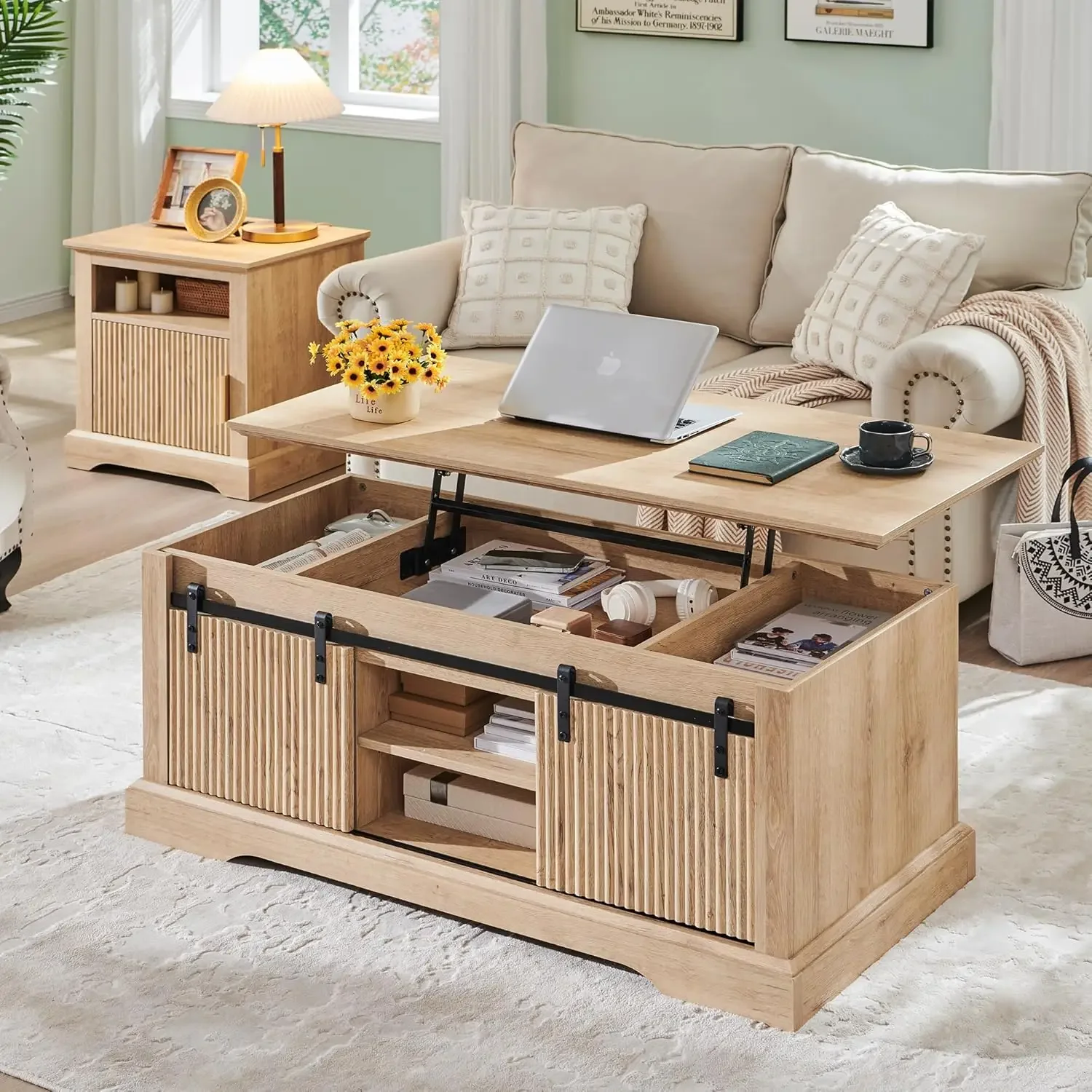
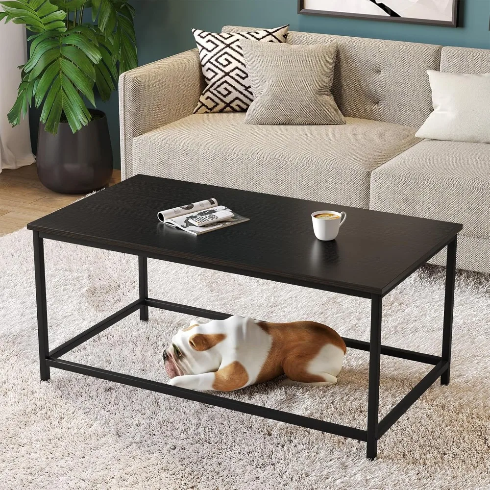
Black is used with precision in Scandinavian furniture design, typically appearing in thin lines, frames, and smaller details rather than large surfaces. A black mid-century coffee table with slender legs exemplifies this approach—the dark elements create graphic interest while maintaining an overall sense of lightness and allowing the piece to “breathe” visually.
For those seeking softer contrast, dark charcoal and deep browns offer alternatives to stark black. These softer dark tones provide definition without the sharpness of pure black, aligning with the gentle, organic quality of Scandinavian design.
Dark accents serve several key functions:
* They anchor a space, preventing it from feeling too ethereal or insubstantial
* They highlight the craftsmanship and construction details of furniture
* They add visual weight and balance to predominantly light interiors
* They create rhythm and movement for the eye to follow
The most successful Scandinavian interiors maintain a careful balance between dark elements and the predominantly light palette. Too many dark pieces would compromise the bright, airy quality essential to the style; too few would result in a flat, undifferentiated space lacking visual interest.
Guiding Principles for Scandinavian Color Selection
When selecting colors for Scandinavian-inspired spaces, several core principles should guide your choices to ensure authenticity and harmony.
Light Maximization: Choose colors primarily for their ability to reflect and amplify natural light. This explains the prevalence of whites and light tones, which help brighten spaces during long, dark Nordic winters.
Nordic Landscape Reflection: Draw inspiration directly from nature, particularly the Nordic environment with its soft, often misty quality. Colors should feel as though they were pulled from a fjord, forest, or snow-covered landscape.
Simplicity and Restraint: Limit your palette to create harmony rather than visual excitement. Typically, authentic Scandinavian schemes include just 2-3 main colors with perhaps 1-2 accent colors used minimally.
Functionality First: Select timeless colors that age well and remain versatile. Trendy or fashion-forward colors have little place in traditional Scandinavian design, which prizes longevity and enduring appeal.
Creating Hygge: Use color to foster comfort and contentment. Colors should contribute to a sense of welcoming warmth rather than stimulation or energy.
Texture Interplay: Consider how different materials in similar colors add depth. A white ceramic vase, white painted wood, and white linen all read as “white” but create richness through textural variation.
The psychological effects of adhering to these principles extend beyond aesthetics. Spaces designed with these color guidelines tend to feel calmer, more organized, and more conducive to wellbeing—all central aims of Scandinavian design philosophy.
When planning a minimalist Scandinavian living room, these principles should inform every color decision, from wall paint to furniture selection to the smallest decorative objects. The result is a cohesive environment that feels intentional rather than accidental.
Practical Application: Choosing Colors for Different Furniture Types
Different furniture pieces play different roles in Scandinavian interiors, and their colors should be selected accordingly. Here’s how to approach color selection for various furniture categories:
For large anchor pieces like sofas and beds, prioritize neutrals or extremely subtle tones. White, off-white, light gray, and beige create the necessary foundation without dominating the space visually. These pieces occupy significant visual real estate, so their colors should recede rather than advance.
Seating options beyond the main sofa—such as accent chairs and dining chairs—offer opportunities for introducing color. A dusty blue armchair or sage green dining chairs can add personality while maintaining the overall serene quality of the space.
Tables and surfaces typically showcase natural wood or minimalist finishes. Coffee tables, dining tables, and desks in light wood tones bring warmth without color saturation. Styling black mid-century coffee tables requires particular attention to balance, ensuring the darker element doesn’t overwhelm the lightness of the overall scheme.
Storage pieces present a choice: they can either blend with walls (typically in whites or very light tones) to visually recede, or they can showcase beautiful wood grain to highlight craftsmanship. What they rarely do in Scandinavian design is introduce bold color statements.
The 60-30-10 rule applies well to Scandinavian furniture groupings:
* 60% dominant neutral tones (walls, large furniture)
* 30% secondary colors (typically wood tones)
* 10% accent colors (smaller pieces and accessories)
Common mistakes include choosing colors that are too saturated or bright for primary furniture pieces, creating competition between too many colored elements, or failing to maintain enough light-colored pieces to preserve the airy quality essential to the style.

Mid-Century Modern Solid Wood Coffee Tables, Mid-Century Modern Teak Coffee Tables
$879.95 Select options This product has multiple variants. The options may be chosen on the product page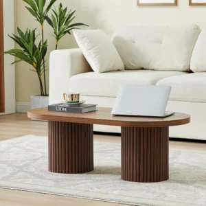
Mid-Century Modern Danish Coffee Tables, Mid-Century Modern Oval Coffee Tables, Mid-Century Modern Solid Wood Coffee Tables
$390.05 Select options This product has multiple variants. The options may be chosen on the product page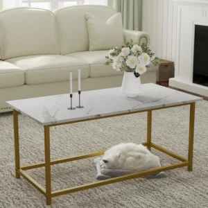
Mid-Century Modern Marble Top Coffee Tables, Mid-Century Modern Rectangular Coffee Tables, Mid-Century Modern White Coffee Tables
Price range: $163.28 through $189.22 Select options This product has multiple variants. The options may be chosen on the product page
Mid-Century Modern Rectangular Coffee Tables, Mid-Century Modern White Coffee Tables
$605.68 Select options This product has multiple variants. The options may be chosen on the product page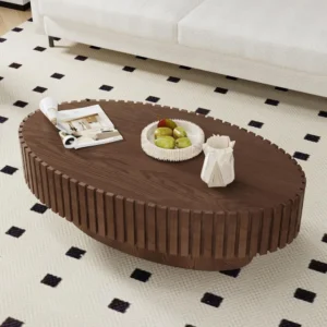
Mid-Century Modern Oval Coffee Tables, Mid-Century Modern Solid Wood Coffee Tables
$679.56 Select options This product has multiple variants. The options may be chosen on the product page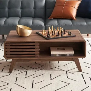
Mid-Century Modern Solid Wood Coffee Tables, Mid-Century Modern Walnut Coffee Tables
$501.53 Select options This product has multiple variants. The options may be chosen on the product page
Harmonizing Furniture Colors with Your Interior
For truly successful Scandinavian-inspired spaces, furniture colors must harmonize with the broader interior elements, creating a cohesive whole rather than isolated attractive pieces.
Wall colors provide the backdrop against which furniture is seen, and should typically be white, off-white, or the lightest possible shade of gray. These light walls reflect natural light and allow furniture pieces to stand out as the stars of the space. Occasionally, a single accent wall in a soft, muted color can work within the Scandinavian aesthetic, but all-over color on walls is rare.
Flooring significantly impacts how furniture colors are perceived. Light wood floors are the Scandinavian ideal, creating a continuous light environment from floor to ceiling. Pale tiles or neutral carpets can also work well. Dark floors create a stronger contrast and require more care in furniture selection to maintain the characteristic lightness of the style.
Textiles serve as color connectors that tie the scheme together. Rugs, curtains, and bedding in subtle patterns or solid colors can bridge between different wood tones or create gentle transitions between furniture pieces. These elements also offer the opportunity to introduce seasonal color adjustments without changing furniture.
Lighting dramatically influences color perception in Scandinavian design. The warm glow of carefully placed lamps can enhance the hygge quality of neutral furniture, while natural daylight brings out the subtle undertones in whites and light woods. When decorating with black mid-century coffee tables, proper lighting is essential to ensure these darker pieces don’t create heaviness in the space.
Common Color Mistakes and How to Avoid Them
Even with the best intentions, it’s easy to make color missteps when creating Scandinavian-inspired interiors. Awareness of these common mistakes can help you achieve more authentic results.
One frequent error is overusing bright or primary colors that disrupt the characteristic harmony of Scandinavian spaces. These intense colors clash with the subtle, muted quality that defines authentic Nordic design. Instead, opt for toned-down versions of your favorite hues—a muted sage rather than emerald green, or dusty blue instead of cobalt.
Introducing too many competing accent colors fragments the visual experience. Authentic Scandinavian interiors typically limit accent colors to just 1-2 choices, used consistently throughout the space. This restraint creates cohesion and allows each color moment to be appreciated.
Neglecting the impact of light on color perception can lead to disappointing results. A color that looks perfect in a showroom might read completely differently in your home’s particular light conditions. Always test colors in your actual space before committing, especially with larger furniture pieces like those found in Danish coffee table collections.
Creating spaces that feel cold or sterile rather than warm and inviting represents a fundamental misunderstanding of Scandinavian design. While the palette is light and bright, it should never feel clinical. This mistake typically stems from focusing exclusively on white without incorporating the warming elements of wood tones and textural variation.
Forgetting texture while concentrating on color flattens the sensory experience of a space. In Scandinavian design, similar colors expressed through different textures create subtle richness and depth. A white painted chair, white ceramic lamp, and white linen cushion all contribute different qualities despite sharing a color.
Evolving Trends: Modern Interpretations of Scandinavian Color
While traditional Scandinavian color schemes remain timelessly appealing, contemporary designers continue to evolve these palettes for modern sensibilities while maintaining the core principles.
“New Nordic” or “Scandi 2.0” approaches have expanded the traditional color palette, introducing slightly more saturated hues while preserving the overall sense of harmony. These modern interpretations might incorporate deeper blues, richer greens, or more pronounced terracotta tones than traditional Scandinavian design, but still within a cohesive, nature-inspired framework.
Sustainability considerations have influenced color choices in modern Scandinavian furniture, with increased attention to natural dyes, non-toxic pigments, and colors that age gracefully without requiring replacement. This eco-conscious approach aligns perfectly with the longstanding Scandinavian value of creating furniture meant to last for generations.
The balance between tradition and personal expression has shifted somewhat, with contemporary Scandinavian designers encouraging more individualized interpretations of the classic palette. This evolution reflects changing lifestyles and a more global perspective while honoring the foundational principles that have shaped modern tables and other furniture pieces.
Global design influences have expanded the Scandinavian palette without abandoning its essential character. Japanese minimalism, in particular, has cross-pollinated with Nordic design (sometimes called “Japandi”), introducing new neutral tones and subtle color relationships that complement the traditional Scandinavian approach.
Creating Your Personalized Scandinavian Color Palette
Developing your own Scandinavian-inspired color scheme begins with assessing your space. Note the direction your windows face, how light moves through your rooms throughout the day, and any architectural features that might influence color perception. These observations will guide your primary color choices.
Start with a neutral foundation, typically whites and light grays for walls and large furniture pieces. This creates the characteristic bright, airy backdrop essential to Scandinavian design. Remember that “white” encompasses numerous variations—find the undertone (warm, cool, or neutral) that best suits your space.
Incorporate natural wood as your secondary “color,” choosing light to medium tones like ash, oak, or pine. The wood grain itself adds subtle pattern and movement without disrupting the calm atmosphere. Wood elements bring necessary warmth to prevent the neutral foundation from feeling sterile.
Add 1-2 accent colors derived from nature and used sparingly throughout the space. These might appear in smaller furniture pieces, textiles, or accessories. Choose muted, somewhat desaturated versions of colors you’re naturally drawn to—dusty pink rather than hot pink, for instance.
Layer in black or dark elements strategically for contrast and definition. These darker touches help define the space and highlight the craftsmanship of furniture pieces, but should be used with restraint to maintain the overall lightness.
By balancing these elements thoughtfully, you can create a space that honors authentic Scandinavian design principles while reflecting your personal preferences. The result will be a timeless interior that feels both fresh and enduring—the true hallmark of Scandinavian design excellence.